+translate page mock-up
At the May 2010 Ubuntu Developer Summit, in Brussels, Matthew Revell and Charline Poirier interviewed four people heavily involved in the translation of Ubuntu.
Matthew and Charline presented each participant with mock-ups depicting the Launchpad Translations team's proposed changes to the +translate page.
The mock-ups
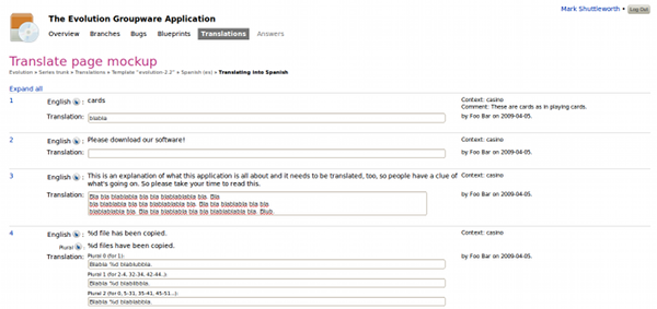
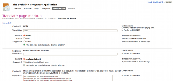
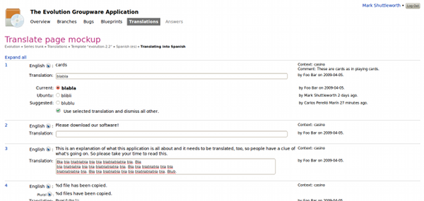
There were three HTML+CSS mock-ups depicting proposed changes to the views seen by a translator and a reviewer.
Download the mock-ups: translate-page-2010.tar.gz (Firefox only)
|
The translator view |
|
The translator view -- zoomed in |
|
The reviewer view |
Participants
Four people took part in our research interviews at UDS-M:
- two are the leaders of their language's Ubuntu translation effort
- one is a professional software translator in his day job
- one commissions third-party professional translators and prepares Ubuntu software for internationalisation
- each of them was male.
The commission
The Launchpad Translations team asked us to show experienced Ubuntu translators a mock-up of proposed changes to Launchpad's +translate page and tell them:
- which aspects of the mock-up the subjects liked and why
- which aspects of the mock-up the subjects disliked and why
- how this mock-up would fit into each subject's translation workflow
- any points of confusion.
Findings
Summary
The proposed design was well received. Each participant said they thought it was an improvement on the current design. However, there were some reservations and suggestions for improvement.
The good:
- Overall, the proposed design is considered to be clearer than the current design.
- Moving the credits and other metadata to a separate column was universally approved of.
- Explaining each plural form was universally approved of and seen as essential to encouraging new translators.
Mixed feelings:
- The participants saw both benefits and disadvantages to reviewing all the plural forms for one string as a single item.
The bad:
- The lack of an explicit way to save work caused confusion.
- It was not obvious to the participants that they could expand individual translations or expand all translations.
- Participants saw no way to filter for strings that need review.
- Presenting the current translation in a text edit field only caused confusion and raised questions over what would happen if someone were to change the edit field contents only to then decide they wanted to revert to the original.
The meanings of the Context and Comment fields were not clear to the participants.
Also:
- The speed of Launchpad, even though not related to the mock-ups, was a cited as a reasoning for work in Kbabel instead.
- Some way of integrating translation teams' glossaries into the +translate page would increase translation quality and help new translators.
Recommendations
Give more control over saving
The current +translate page has a single "Save and continue" button at the bottom of the page. This saves all the strings on the page and loads the next set of strings from the template.
The mock-up proposes automatic saving whenever focus is removed from the text edit box.
Neither of these options offers the control that the subjects wanted. The subjects had three primary concerns:
- the potential for loss of data due to browser and other stability issues
- the seeming ease with which the new mock-up would allow people to accidentally, or prematurely, save a translation, particularly where this would overwrite an existing translation
- the lack of control offered by the current design over which translation strings are saved.
In response to these concerns, I suggest the following changes to the proposed design:
- Add the option of automatic timed saves, to prevent loss of work due to browser or other stability issues.
- Retain a single "Save" button but enable the user to choose which translations to save, perhaps by selecting check-boxes against each translation to be saved.
- Avoid triggering destructive actions -- such as overwriting existing work -- when the user changes their focus (e.g. moves the cursor from one text box to another).
The idea is that after new translation is saved, previous translation is added to the top of the list of all suggestions, with an option titled "Revert to previous:" or similar; I find that much better while keeping automatic save (one way or another: on leaving focus is probably not a good strategy, but we can come up with better ones: when you start translating a different message or click on "show me more messages link"). — Danilo 20100527
It is not easy to find a good auto-save strategy and automatically saving an unfinished translation has a deep impact for the future translation as it may appear as a suggestion. Unless we will find a telepathic web technology for reading users mind, I think that we should keep the explicit translations saving. Modern browser (like Chromium) have good recovery support and they can refill a form after a crash. - AdiRoiban
More strings on one page
The current design presents a new set of strings to translate or review, if available, when the user presses the "Save and continue" button.
One of the suggestions for the proposed design is that completed translations should pop off the page, with a replacement translation popping onto the page at the bottom.
- An experienced translator/reviewer can work quickly through the ten strings presented in the current design. Waiting for the next ten to load can be frustrating.
- Popping strings on and off may be convenient for drive-by translators but the research subjects were unsure how they would get back to a specific string
I suggest that the Translations team:
- Allow translators/reviewers to specify the number of strings that appear on a page; scrolling would be preferable to multiple page loads.
Launchpad doesn't allow user-based settings like these. Storing them in cookies would defeat the purpose a bit, though might be an improvement. — Danilo 20100527
Rather than adding an option to choose between a batch size of 1, 5, 10 or 30 we should investigate why do they need it - AdiRoiban.
- For a translators, presenting only 1 message should avoid scrolling.
- For a translators presenting 30 messages should speed up the translations, as loading 1 page (instead of 30) should be faster.
- For a reviewer, presenting 30 messages should help while approving/dismissing suggestions.
- Load the next set of strings asynchronously but present this in such a way that the user can easily find and work on a specific string.
This is something that I think we should do. It'd need careful thinking of how to do it best. — Danilo 20100527
Asynchronous message loading and saving should be a big usability improvement by making Launchpad Translation feel fast. - AdiRoiban
- This could also reduce the need for custom/different batch sizes.
- Async(AJAX) loading of translations should
reduce server load with a drawback of increasing (around double) the time interval during which a message is vulnerable to multiple submission conflicts. I think that we can live with that.
Async saving would be more complicated as translators should be informed about errors/conflicts as soon as possible. Finding a good notification/correction mechanism would be the key to success for this feature

Better explain the terminology
The meaning of the some of the terminology on the mock-up was not obvious, even to experienced translators.
I suggest that the Translations team use mouse-overs and help pop-ups to clarify their usage of the terms:
- context
- comment: is this the .pot or .po comment?
- Ubuntu: which language package does this string appear in?
- Suggestion: where does this come from?
Presenting a popup/tooltip for context,c-format,location and other gettext terminology should be cheap. - AdiRoiban
In normal use cases, POT comments will be listed on the same row with the original message, while the PO comments will be listed on the same row with the translation message. Also, usually, POT comments are in English while the PO comments are in the current language (translators will use their native language for adding language specific comments.) - AdiRoiban
Reconsider the need for the unzoomed translator view
Each of the participants was surprised by how little information is available in the proposed translator view. This was compounded by none of the subjects realising that the numbers in the left-hand column are links to an expanded view. Similarly, the "Expand all" link was felt to be unobvious.
The proposed translator view lacks the context a translator needs to produce good work. Requiring that translators click an, as yet obscure, link to see that information seems like an unnecessary barrier.
I suggest that further testing be done to determine the usefulness of the stripped-back translator view and, if it is retained, how best to make the further information available with little effort.
For further testing we'll obviously have to implement a full mock-up behaviour as well. Also, this summary says nothing concrete about what things did people miss to "produce good work". We'll also need to decide what users we are targetting with each page: testing so far was very limited. — Danilo 20100527
What I think is missing from producing good work: (note that some team are using external tools to work around the lack/hard to find information from Launchpad)- AdiRoiban
- The zoom-out view is showing only 3 suggestions... in order to "produce good work" translators will need to have access to all suggestions, including dismissed suggestions to avoid "producing the same bad work" over and over again.
- When updating(adding new translations) a template, reviewer/translators will want to keep the new translations consistent with the previous one. A tool for checking local POTemplate consistency and global project/distribution consistency should help with "producing good work".
- Some upstream translators might use POFile comments for informing other translations regarding some specific translations aspect affecting only that language (POFile). Launchpad will not show those comments and translators might ingore those comments/messages.
- If a translator knows more than 2 languages (English and mother tongue), when in doubt he/she can take a look at translations from other languages done for the same original message. Right now, he/she will usually click the zoom-in view and for checking 5 other language will have to make 5 other page loads.
Make it easier to see who did what
Each participant stressed the importance they place on who has provided a suggestion, when they are reviewing. Each subject felt that the proposed design improves the clarity of the page. However, it was noted that moving the credits to one side makes it harder to tie a suggestion to its author, particularly where there are several suggestions.
I suggest that alternating coloured backgrounds be used to tie each suggestion to its credit.
Making an association between the author and the background color, similar to gooby, could have the side effect of adding to much colors on that page. In my opinion, just highlighting the row(associated data) on mouse over should help identifying the connection between the author and the translation. - AdiRoiban
Integrate team glossaries
Although this is not part of the current or proposed designs, three participants spoke about the role of translation team glossaries in ensuring high quality translations.
Translation teams have created and shared their own tools to make glossary look-up easier. However, use of these tools requires additional effort and are only available to those who are already involved in the translation team, making them of little use to those new translators who likely have the greatest need for the glossaries.
Although it has the potential to be a big job, I suggest that the Launchpad Translations team consider how to integrate translation team glossaries into the +translate page, whether that be a simple search box or, perhaps more usefully, individual word recommendations automatically drawn from the glossary and displayed below the English string.
Not coming in anything that can be called "short-term" — Danilo 20100527
Reconsider grouping of plural form variations
The proposed design simplifies the review of translations that have multiple plural forms by providing one radio button for all those plural forms, allowing the reviewer to accept or dismiss them all in one go.
This was partially welcomed with the reservation that an error in one plural form would require rejecting any other plural variations that were perfectly good.
I suggest that the Launchpad Translations team consider allowing reviewers to edit individual plural forms in-line, so that plural variations can be accepted or rejected in one action while allowing the reviewer to make adjustments as necessary.
When they choose a single suggestion, they should be able to edit it inline (just like it works today): so, that was planned as well, but not everything is implemented in the mockup. — Danilo 20100527
What is missing
The research participants noted that certain information was missing. It is likely that some or all of this is due to the limitations of the mock-ups.
These included:
- Suggestions from other languages.
- The ability to view only untranslated strings.
Mock-up is simply incomplete. That's a lesson for the future. — Danilo 20100527
Interview transcripts
The interview transcripts are available as an OpenOffice spreadsheet.


